

The team was tasked with rebranding a large Volga Region network delivering products from abroad.
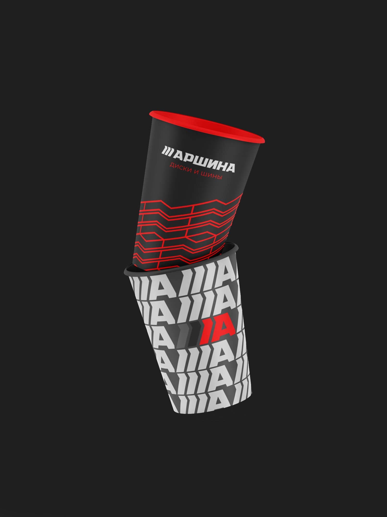
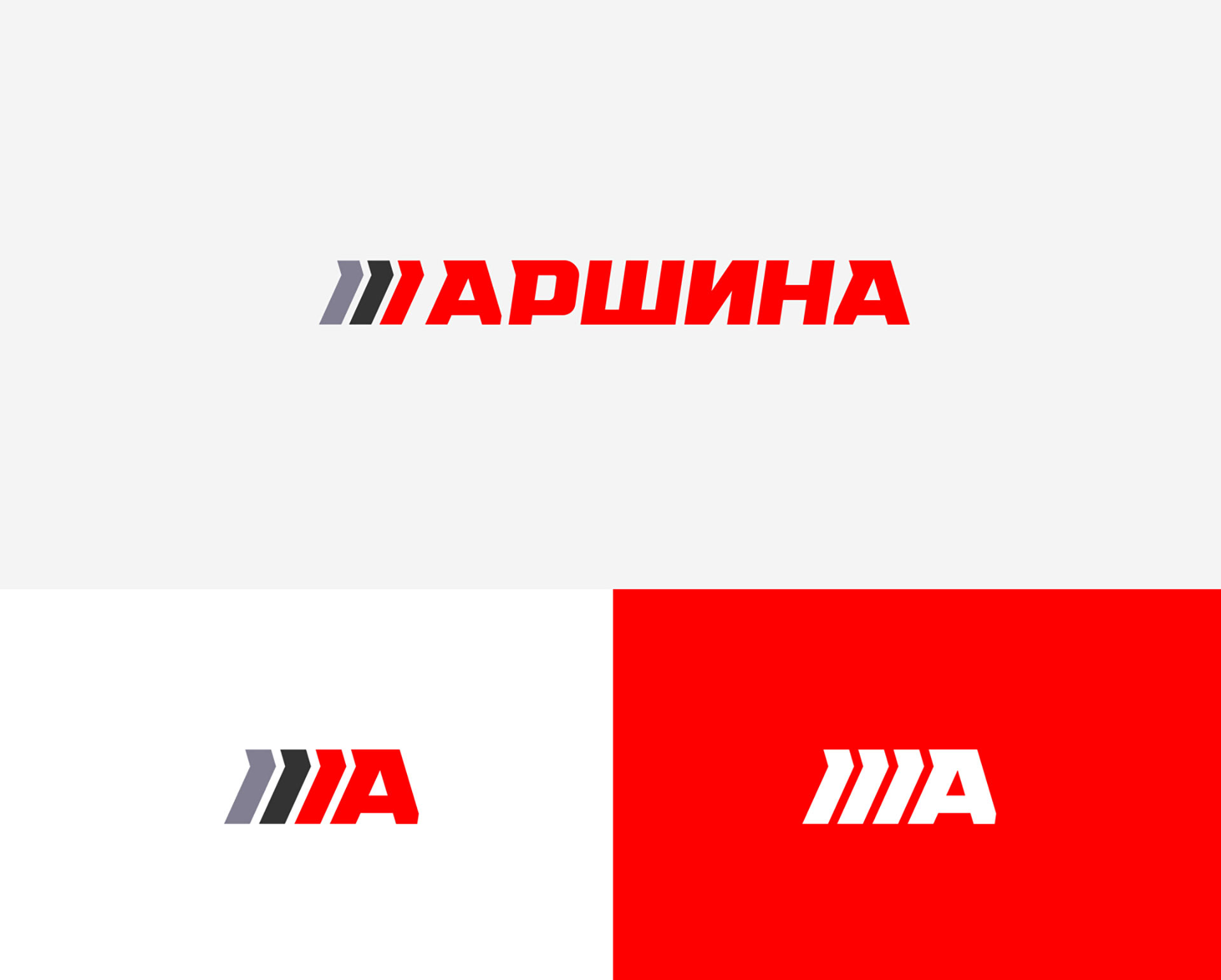
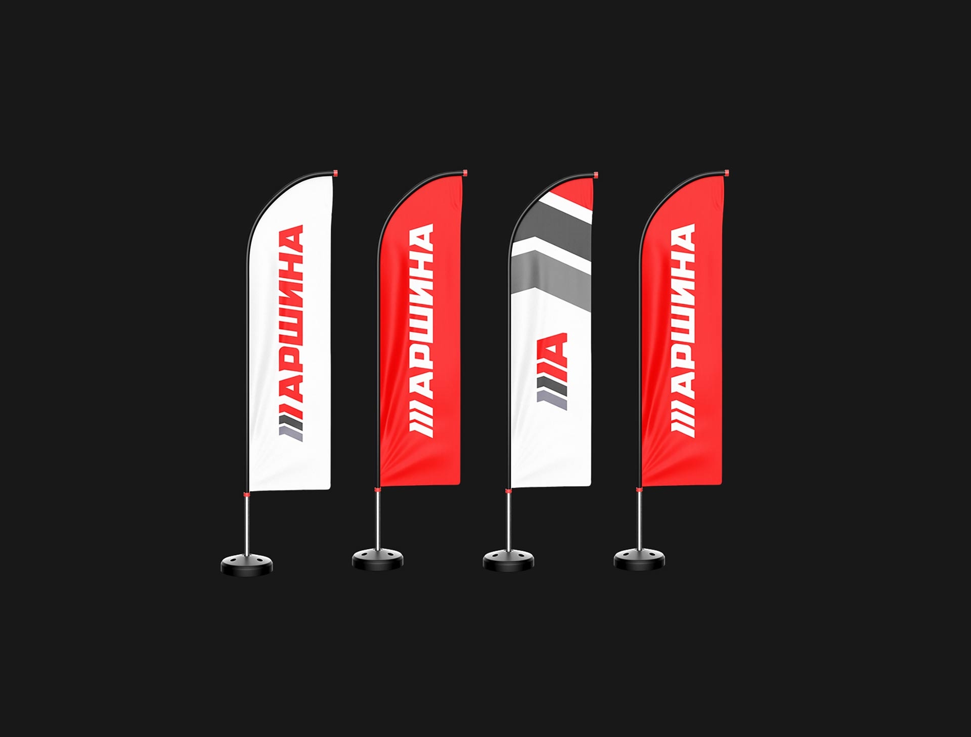
One of the key factors of this project was the need to increase brand awareness, due to the complete rebranding of the network. The color palette with red "rodeo" and "wet asphalt" emphasizes the high amplitude of emotions experienced from driving your favorite car. In the patterns and logo, the tread pattern itself served as the solution. Racing style and reliability - what else does a car enthusiast need!


From the very first meeting with the studio executives, I realized that I had come to the right place. We quickly put together an action plan and got to work. Everything is clear, coordinated, prompt, I recommend it!